Sunscreen Packaging
Category
PackagingAbout This Project
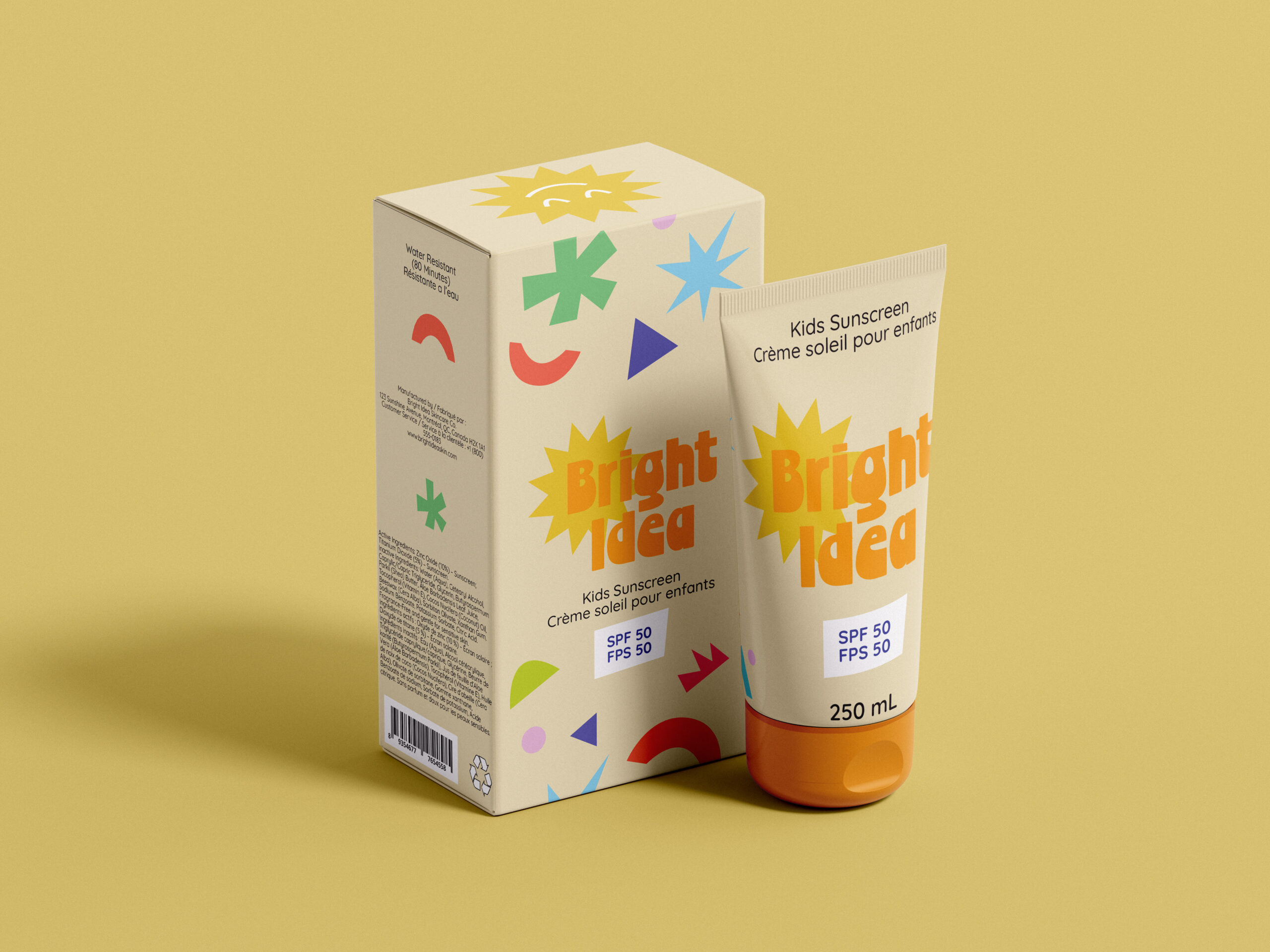
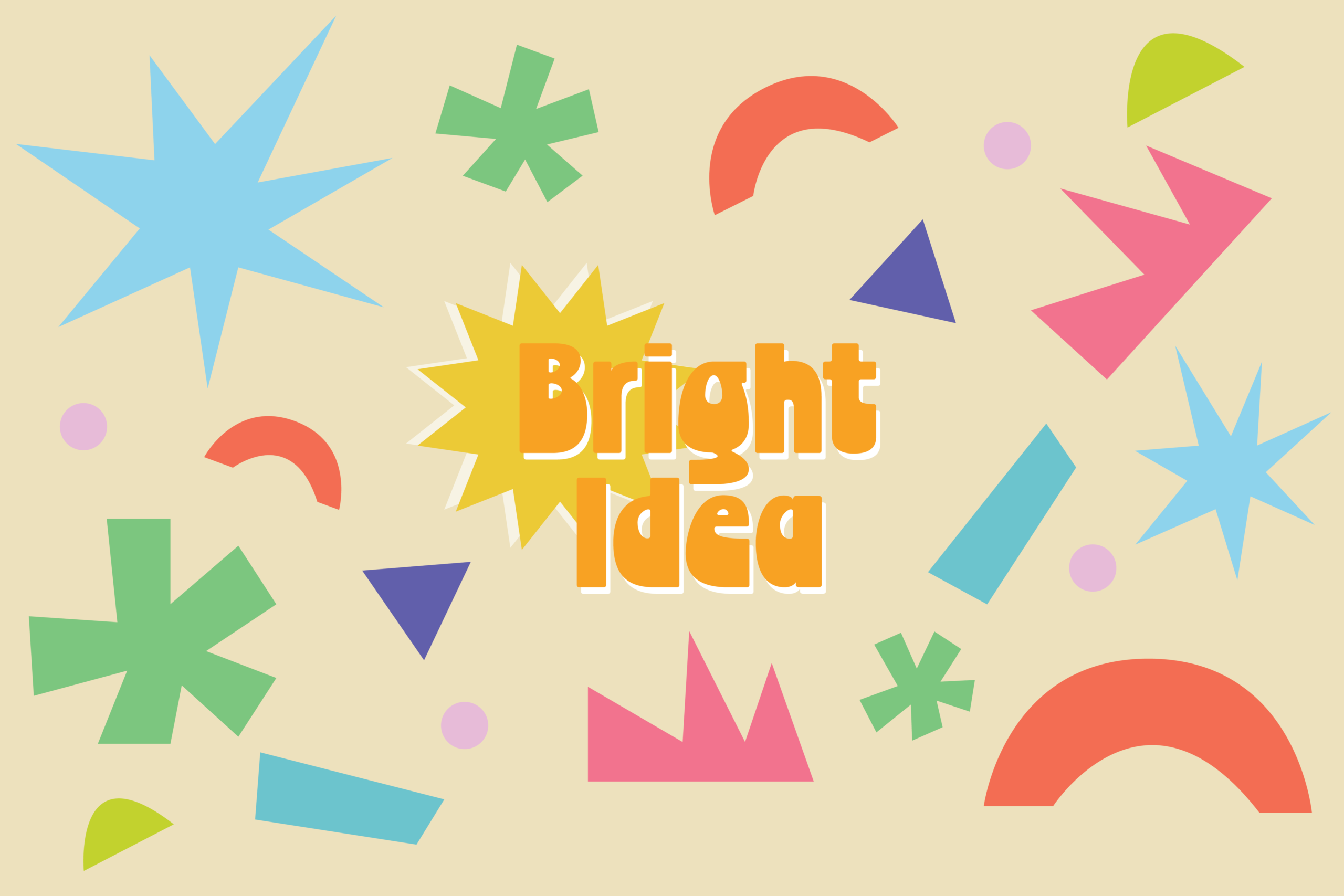
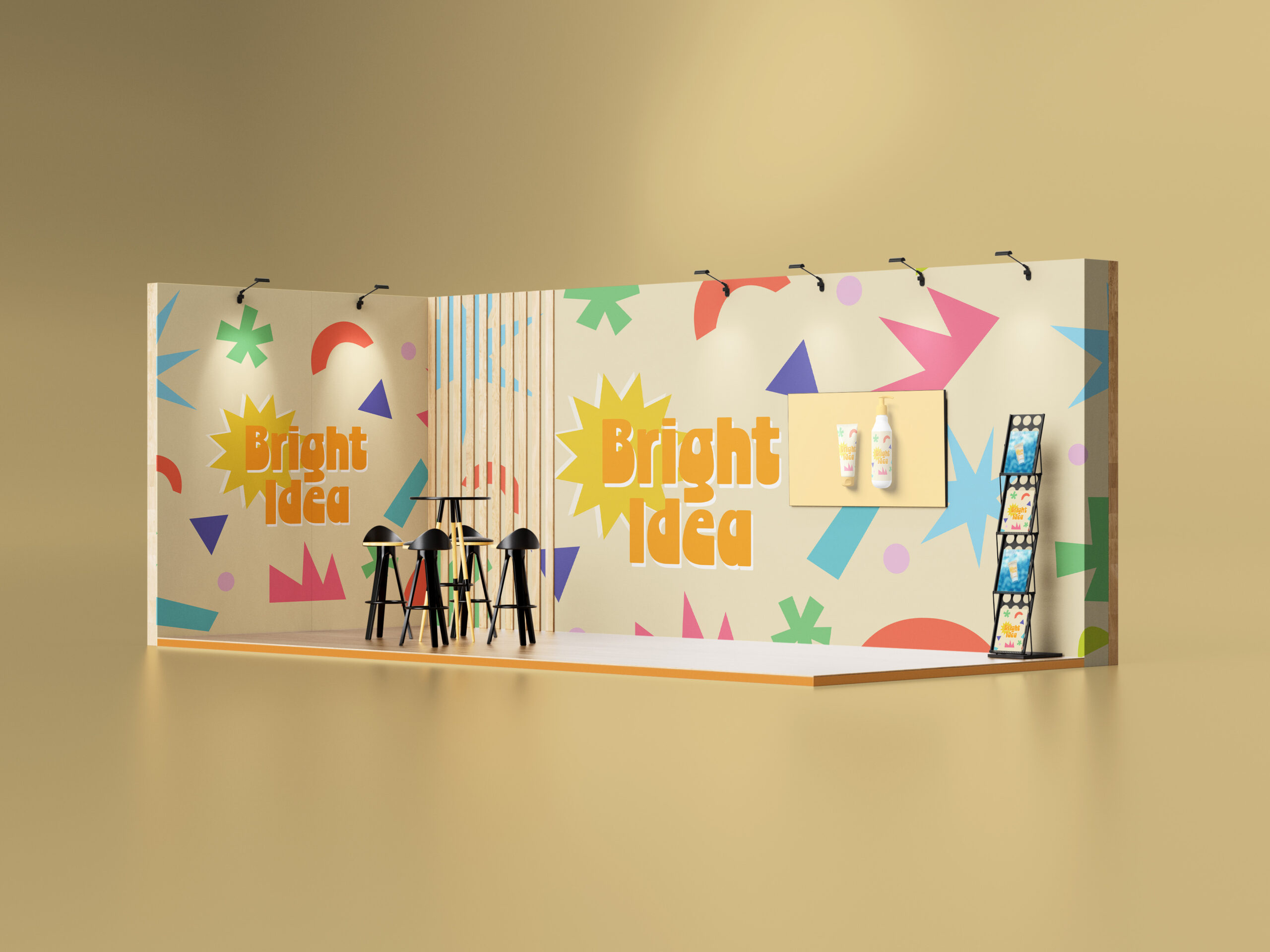
For this project, I designed the complete packaging system for a kids sunscreen brand called Bright Idea. The goal was to create something that felt playful, safe and approachable for both children and parents, while still looking clean and professional on retail shelves.
I developed the visual identity, logo, color palette and graphic language, using bold shapes, bright colors and simple typography to communicate energy and positivity. I then applied the branding across the full packaging system, including the tube, box, and dieline, ensuring the design worked cohesively in both 3D mockups and flat production layouts.
This project strengthened my skills in packaging design, brand consistency, and translating a concept into functional, shelf-ready products.